The Singleton brand has received a modern overhaul. Singleton Council has developed a new visual identity to better reflect the identity of the local government area that reflects the changes that have occurred in Singleton in recent years.
It represents Singleton Council as a modern, professional, innovative and reliable organisation.
The new logo includes blue for sky and water, representing the life force for agriculture and new horizons for opportunity and innovation; green lines representing crops, cultivation and a commitment to hard work as well as the national parks and natural environment; and a solid Singleton red base representing the richness of the region’s natural resources and economic strength, energy, vitality and resilience.
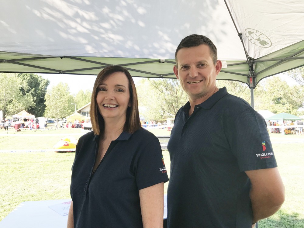
There will be a progressive roll out to ensure the most cost-effective implementation of the new brand.
Mayor of Singleton, Cr Sue Moore, said the new brand was designed to capture the historical significance of Singleton’s agricultural and resource sectors, while setting the direction for the future.
“Singleton has been going through a significant period of growth and change over the past few years, most visibly with the transformation of the town centre and improvements in infrastructure such as the Hunter Expressway,” Sue said.
“Old perceptions are changing and people are starting to recognise Singleton as a vibrant and diverse economy with opportunities for investment; a great lifestyle choice for families with state-of-the-art recreation facilities, shopping and dining; and a fantastic tourism destination with plenty on offer from the vineyards to adventure activities.
“The new brand positions Singleton in the marketplace as the modern, innovative and forward-thinking community we are and enhances our appeal to investors, prospective new residents and visitors.
“It’s also a visual demonstration that Singleton is a progressive community and will provide a greater platform for us to advocate to other levels of government for the modern services and infrastructure we need.”
General Manager of Singleton Council, Jason Linnane said the brand was also designed to reflect the changes within council, including a greater emphasis on service delivery and customer service.
“There has been a significant shift in the way we review the services we deliver, who we deliver them for, questioning if we are meeting those expectations and looking to see how we can deliver services more efficiently,” Jason said.
“Our staff are continually looking for innovation and putting in place systems and processes to make sure we’re doing things in the best possible way, but most importantly, that we’re doing what we said we would do in our Community Strategic Plan (CSP).
“To be the most effective council we can be, we’re also placing a significant focus on recruiting the most skilled and experienced staff to our organisation.
“Part of that is how we present ourselves to the community, to industry and even internally to our staff. The new brand is a more accurate representation of what we are already achieving as an organisation and where we’re heading in the future.”
IMAGE |Singleton Council’s Manager Integrated Risk, Deborah McDonaldwith Manager Infrastructure Delivery, Damian Morris in the new Friday polo featuring the new logo.


